
June 2012
The need to integrate data from images of different modalities is a universal problem for the geosciences. Interactive multi-image blending can be a useful tool for facilitating the interpretation of complex information from multiple data sources.
We have been developing a variety of techniques that support the blending of multiple images under a range of different situations. Blending can also be employed to interactively explore parameter variations for enhancement techniques. Using blending to explore different scales of analysis is particularly useful.
This web page presents some movies of preliminary prototypes that
we have been developing. You will need a current browser that
supports HTML5 and a good broadband connection to view them.
This example shows the visualization of some ASTER data using our 'clique blender'.
In this demo we are viewing the first 5 bands of data. Nodes representing each image are arranged in a circle. Lines join every node to every other node. Moving the mouse cursor along any of the lines performs a blend between the two images that are joined by the line. Thus every image can be compared against every other image.
When watching the movie try to watch both the image and the cursor movements, this can be a bit tricky. We believe interactive blending is very much a personal activity where having direct control is important. It is hard for an onlooker (such as you viewing this page) to obtain the same perceptual benefit as a direct user would gain.
You will see here that the interactivity is crucial. A static
blended image is useless. By making exploratory cursor movements the
user is able to determine which features are associated with with each
of the spectral bands.
This example shows radiometric data being visualised using our interactive ternary plot.
With the cursor positioned at the centre we obtain a standard colour plot where the red component is given by potassium, green by thorium and blue by uranium. Moving the cursor away from the centre results in the relative strengths of the three components being proportionally changed. If the mouse is moved to the potassium vertex of the triangle only the potassium component is displayed. Positioning the cursor on the line joining the potassium and thorium vertices displays a mix of just those two components, etc.
This data is from Geoscience Australia.
This example shows two things
Images with a high dynamic range, such as aeromagnetic images, are difficult to present in a manner that facilitates interpretation. Techniques such as histogram equalisation, automatic gain control, or the tilt derivative can help, but are not always as effective as one would like.
What is presented here is a new method that compresses the dynamic range of an image while preserving and enhancing local features. The method is based on extracting local phase and amplitude values of the image. The dynamic range of the image is then reduced by applying a global tone mapping function to the amplitude values, for example taking the logarithm, and then reconstructing the image using the original phase values.
An advantage of the method is that the scale of features that are highlighted can be controlled by using different levels of high-pass filtering when forming the image reconstructions. Note that this process is not the same as upward or downward continuation.
In the movie the cursor is shown as a black dot. As it is moved up and down in the image the scale of analysis is changed and in the process different structures become prominent.
This data is from the Geological Survey of Ontario.
For comparison shown below is a histogram equalised version of the data above.
This example shows the blending of two images over multiple scales in conjunction with our dynamic range compression algorithm.
As the cursor is moved from right to left the image blends from magnetic to gravity data. As the cursor is moved up and down the scale of analysis of the blended images is also changed.
As the image blend and scale is changed you will see the relationships between the two data sets becoming very apparent.
The gravity and magnetic data is from Geoscience Australia.
Again, this illustrates how interactivity is crucial. The exploratory
cursor movements allow you to determine which features are associated
with the gravity data and which features are associated with the
magnetic data.
Another example showing our multi-scale high dynamic range compression algorithm applied in conjunction with orientation filtering to a high resolution data set of the Yilgarn.
In this blending tool as the cursor is moved around the circle we blend between images filtered at different orientations. As the cursor is moved to the centre the oriented image is also blended with an average/sum of all the images.
This data is the property of Fugro Airborne Surveys Pty Ltd.
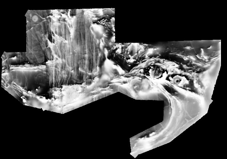
Another example showing our multi-scale high dynamic range compression algorithm applied to a high resolution data set of the Yilgarn.
This data is the property of Fugro Airborne Surveys Pty Ltd.
An application of the cyclic blender on orientation filtered images to highlight lineaments. The input image is thorium data in the vicinity of Karoonda in the Murray Basin. Please note the images seen here suffer somewhat with the video compression.
An application of the ternary blender to view all three channels of radiometric data in the vicinity of Karoonda in the Murray Basin.